Saturday 23 March 2013

Feedback


Which parts of the video stand out to you the most?
The representation of time going backwards to the beginning of the night where the party started through using clouds and sky shot fast rewinding has a good effect because it tells the viewer of the video there is more to the night, enhancing the lyrics to the song.
I liked the shots that were in slow motion, I think that they stand out and give a more ‘party’ feel. I liked the split screen shots with the 4 girls. – Gave a sense of friendship and youth
I particularly like the two parts of the video in where it shows the shot of the road at night. I am also impressed at the part were the four individuals are shown.
The shot with the faded out traffic over the top of the artist, I think it is really effective. I also think that the lip syncing shots are done very well and are done on time with the song.

Is there anything that you didn’t like or think could be improved or replaced?
There was nothing inpaticular that I didn’t like although I think you could include more night time shots as there are quite a few daytime ones, the night time may give it more of a party feel as people normally would go to a party on the night.
I think that the shadows in the balloons shot could be improved by having a plain white background. Partying in the daytime.
The weather is a bit gloomy in the cloud shots, the video is also very girly
I think that there could have been more locations involved in the video.

 Did you understand the idea behind the music video? E.g. Why the beginning is in black and white and it ends in black and white?
Yes, it has a good effect rewinding time back to the beginning of the night almost to relive it all over again. Capturing the idea of the song lyrics, also highlights how good the party was etc.
Yes, the start and end of the party/going out
Yes, it is very easy to understand
Yes, it shows the end of the night and then rewinding to the beginning to show the night

Do you think all of the shots in the video look good? Would you say any of them don’t go with the rest of it or don’t make sense?
I think more night time shots would have a good effect but also maybe have the artist in more party clothes and make up etc. For one of the single shots of the artist performance to add a bigger party theme
All good and flows nicely, professional
Yes I think it was very good, none of the shots didn’t go with the video
I like all of the shots, I think that they all go together well and they flow really well.

Do you think that the three products go together? Do you think the designs of the digipak and poster go with the theme and style of the music video?
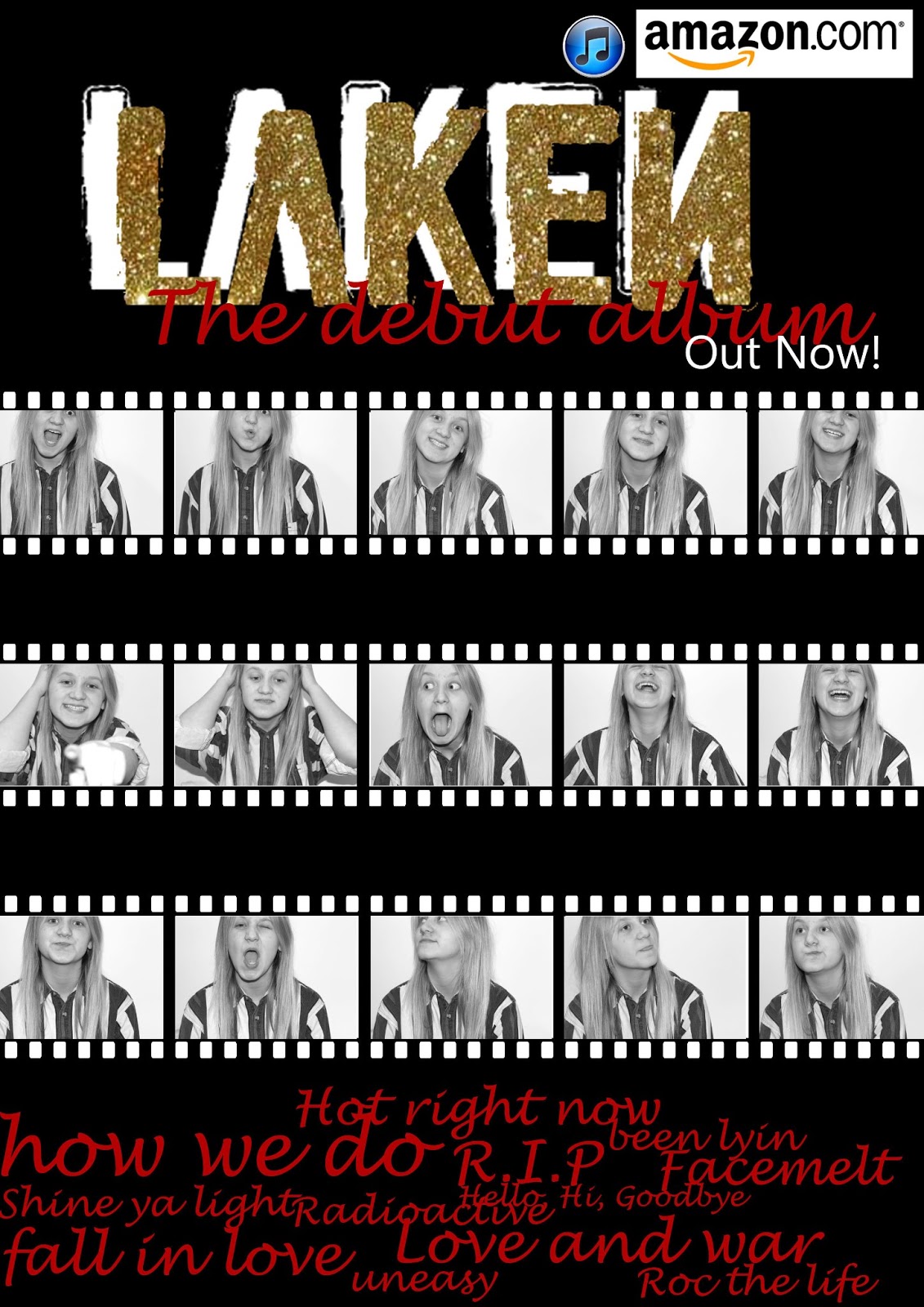
Yes, I think the poster advertisement with the several shots of different poses aren’t too serious and show the comical, fun side and highlight the style well. Shows that the artist wants to have a good time like the style of the music, upbeat, pop sound.
Yes, perhaps replace the red writing to pink to match the balloons?
Yes, the theme works really well through all the products
I think the digipak and poster go well together as they both have a really strong colour scheme throughout

Do you think the design of the Digipak works? Does it look professional? What do you think of the imagery and how effective is it?
Yes, the design of the digipak looks professional and clear that time and effort has been put into the product. Maybe look at the style and font used for the artists name, possibly a different colour and outline
Its good, professional and simple. Can attract male and female
Yes, it is good, It has a good colour scheme
I think the design looks professional; I could imagine this in a shop. I think the images are very effective and work well.

Does the colour scheme work for the digipak and poster?

The colour scheme supports the smart, professional look, highlightingthe artists songs etc. However maybe change the colour of the title to silver instead of gold with less of the white border on the poster
Yes, I like it, it isn’t predominantly male or female but attracts both
Yes, see above answer
Yes,  the colour scheme is the same throughout and works really well

Is there anything you would change or improve on the digipak?
There is not much I would change as mentioned earlier. I would have a look at different colours for the title and you could maybe change the pictures between black and white and colour
Perhaps a coloured image instead of black and white
No, there is nothing to improve
No, I think it all works well

Do you think the design of the poster works? Does it look professional? What do you think of the imagery and how effective it is?
The imagery is effective because the different poses emphasis the light hearted and fun of the artist which is portrayed throughout the music video
Yes, I like the film strip, It looks really good, like a casting photo-shoot
Yes, I really like the imagery used
I think the poster works well, I think all of the different sequence images, I think they work really well for the album

Friday 22 March 2013

Final cut of music video


This is the final cut of our music video. We changed the settings to Widescreen when exporting the video on the editing software to fix the problem of the video been very small and squashed into a square but even when we changed the size of the video there is still problems with the size when we upload it to Youtube  We have no reuploaded the video and this time it appeared on the screen full size.

On the final edit of the music video we changed a few different shots. For example the shot were the artist is shown in different outfits was changed so that it fit with the beat of the music. Before we changed it the videos were all different lengths and didn't go really go with the music. Another part of the video that we edited was all of the split screen effects as they were too big compared to the rest of the video. We made the separate videos smaller so they would be the same size as the rest of the video when they were all put together. We was going to make the whole video black and white as the night out kind of style might come across better, however when we asked people what they thought of the video they said that they liked the video in colour with the beginning and the last shot in black and white.

Final Digipak and Poster advertisement


Thursday 14 March 2013

Album poster developments

This is the first part of the poster design that I did. I thought that using the text that I have used on the digipak as relates them to each other. People will recognise the font. I have changed it slightly by making the shadow behind it white instead of black because I am using a black background on this. On the digipak the background behind this text is an image so I could have the shadow in black. I have added the glitter effect over the main body of text, I really like the effect of this. When I tried to create the gold just using the colours it didn't really work very well so using the glitter instead works a lot better.
Another piece of text that I have added to this is the 'Debut album' underneatht the album and artist name.


On this second development of the poster I have added images onto it. I have also used images that I have used on my Digipak design because it then all relates to each other. I kept the images black and white on this as well, I want the debut album part to stand out so people know that it is a new artist. The development next to this one is the same but I have changed 'Debut album' to 'The debut album' as I think it looks better overall on the design.


On the third development of the poster I decided to change debut album to the debut album because I think it looks better on the presentation of the poster and it also sounds better.


On this one I have added the names of the album tracks underneath the image. I think that this works well and gives people a little sneak preview of what is going to be on the album.

Digipak design

To create the font for my digipak I used the website Da font and choose the font I thought would suite the album and style I was going for the best. I ended up choosing a font called denial. I felt that this would go really well with the style I was going for which is quite Glamorous with the rich red and gold colour scheme. I like that the font looks quite distressed and rough but is also very clear and fun.
After choosing my font I then typed the artist name into the website, which is Laken, so that it came up with the name in my chosen font. I could then screen shot the page and crop the text so that I can use it on my digipak. I screenshotted the text and then pasted it into photoshop.
This print screen below shows the text on the Digipak before I added the gold glitter over the top. To get rid of all the white background around the text I used the wand tool and clicked on the white and then clicked on select>similar. I then pressed delete to delete all of the white from the image.

This print screen also shows the text on the side of the digipak in white. To turn the text white for that part of the digipak I clicked on Image>Adjustments and then Invert.


 These print screens show how I added the glitter effect onto the text on the front of the digipak. I used this image that I searched for on google images and copied and pasted it into photoshop on a separate layer to everything else. I made sure that the layer was above the layer with the black text on so it would appear on top of it.
After copying and pasting the image into photoshop I then used the wand tool to select the text and then clicked on select inverse so it selected all the background behind the text.


The next step was to delete all of the extra image that I didn't need. So I deleted this and I was left with the gold glitter image in the shape of the text that I had already inserted. I then moved the gold glitter text on it's layer so it slightly revealed some of the black underneath, giving it an overlapping effect.


Wednesday 13 March 2013

Digipak inside cover

This is the design for the inside images of my digipak design. I decided to design it in the style of a film strip. I wanted to use this idea for my design because I liked the idea of having the images like a sequence all with the same framing but with the artist moving around in the camera and pulling different faces at the camera. To take these images I put the tripod with the camera on facing the white wall and got the artist to stand in front of it so I could decide how I wanted the images to be framed. Once I was happy with how the images were framed I then took the continuously one after another so that I had the sequence of the artist moving around.
I made the images black and white as I think it goes with the video, the beggining parts of it are in black and white. It also goes better with the idea of a night out. I like these images as it shows the artist having fun and the video is a fun night out with a group of friends and I wanted the idea of fun to be shown accross all three products.

Front page of digipak design