Brief
1. A promotional package for the release of an album, include a music promo video together with two of the following three options:
• A website homepage for the Artist/band
• A cover for its release as part of a digipak (CD/DVD package)
• A magazine advertisement for the digipak (CD/DVD package)
In what way does your media product use, develop, or challenge forms and conventions of real media products?
For my music video I chose the song How we do (Party) by pop/R&B artist Rita Ora. Rita Ora is a fairly new artist in the music industry, bringing out her debut album last year and has had number 1 singles. The song I chose already has a music video that the artist brought out April last year. When I researched different music videos I found a few that influenced me in various different ways. We took different elements from different videos and based the idea behind our music video on the style of the popular tv series, Skins. Skins is a television series on e4 about a group of teenagers and their life.
Some of the videos I looked at that as influences are Bruno mars - Locked out of heaven. I liked the pace of editing and because How we do is a very upbeat song it goes with the idea of showing friends having fun and youth through quick cuts between different shots. We edited to the beat, which is a very common convention of all music videos as well as pop. An example of us cutting to a specific beat in the song is when the artist is changing between different outfits and in each beat the clip changes to a different outfit. When we first edited the video some of the shots did not cut to the beat and I didn't think that it worked as well as when we changed it to rythmic editing. Pop songs are usually quite fun and upbeat so the videos reflect this by having fast paced editing. It helps to get the message that the people in the video are having fun across. Another video that I looked at is Usher - Numb. I loved the effects of the lights over Usher in the video and wanted some similar effects to be in mine. Having overlapping videos is not a typical convention of a pop music video. They are usually made up of very simple shots and sometimes include split screen.
The music video includes some narrative; the idea behind the video is that is it about a night out between a group of friends. Showing friendship, youth and fun in the video. The video is mainly performance based, Pop music videos are usually either or both performance and narrative based videos. Also when lip syncing is shown in a performance shot it is usually a close up or medium close up of the artist so you can see clearly see the artist lip syncing the words to the song. At the chorus of the song the music speeds up and we edited the clips to cut between each other faster and have a lot of different changes of mise-en-scene and location. This is very common for a pop video, the song going between verse and chorus, the verse is usually a lot slower than the chorus so the pace of editing changes between the two.
 Another
convention that is used in real media texts that we have used is a jump cut. We
haven't used any other types of cuts in the video other than these as I don't
think that they would go with how fast the song is, a jump cut allows us to cut
between the videos quite fast and to the beat of the music. When it came to the
chorus of the song the music has a lot more energy and I wanted this to be
shown to the audience through the editing. The theme for our
music video was fun and friendship and we decided to show this through a night
out. One of the conventions for a typical pop music video is that it should be
bright and colourful. Our video fits in with
this convention; pop videos are also usually very fun and light-hearted and are
mainly aimed at teenagers. The target audience for this music video is
teenagers so we have followed a lot of the conventions of a typical pop music
video.
Another
convention that is used in real media texts that we have used is a jump cut. We
haven't used any other types of cuts in the video other than these as I don't
think that they would go with how fast the song is, a jump cut allows us to cut
between the videos quite fast and to the beat of the music. When it came to the
chorus of the song the music has a lot more energy and I wanted this to be
shown to the audience through the editing. The theme for our
music video was fun and friendship and we decided to show this through a night
out. One of the conventions for a typical pop music video is that it should be
bright and colourful. Our video fits in with
this convention; pop videos are also usually very fun and light-hearted and are
mainly aimed at teenagers. The target audience for this music video is
teenagers so we have followed a lot of the conventions of a typical pop music
video.
The different use of camera shots in pop music videos range from long shots to extreme close ups. Close ups are used often because it shows the emotion of the video and also shows the lip syncing. Close ups also create emphasis on the location, our music video has a lot of close ups in but we also included some long shots which aren't used as often. The very first shot of the artist walking is a long shot; it shows all of that location and establishes where they are. The artist is not lip syncing in this shot so that is why we chose to have it set up as a long shot. Also in a typical music video the camera will follow the artist in the camera shots, as they are the main focus, we did this in our music video. When there is more than one person in the shot the camera was always focused on the artist out of the three people.
Digipak
 On
my digipak I wanted to have a very strong colour scheme that stood out and
really gave the artist their own style that people would recognize I used the
same style of text on the digipak and the poster so that this text is what
people recognize the artists name as. On most Digipak on the front cover you
will be able to see an image of the artist and also their name. I have kept to
this convention on my design as it is the first thing people will see of the
artist so it is important that their name and picture is on there so people
know who they are. The name of the album is the name of the artist which is
‘Laken’ a lot of new artist will call their debut album by their name and I
chose to do this so I could have the name of the artist and also the name of
the album on the front cover.
On
my digipak I wanted to have a very strong colour scheme that stood out and
really gave the artist their own style that people would recognize I used the
same style of text on the digipak and the poster so that this text is what
people recognize the artists name as. On most Digipak on the front cover you
will be able to see an image of the artist and also their name. I have kept to
this convention on my design as it is the first thing people will see of the
artist so it is important that their name and picture is on there so people
know who they are. The name of the album is the name of the artist which is
‘Laken’ a lot of new artist will call their debut album by their name and I
chose to do this so I could have the name of the artist and also the name of
the album on the front cover.
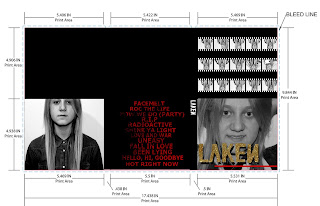
Typically on a digipak the colours will represent the mood and emotion of the songs and style of the album. As the song is all about having fun with friends I wanted to show this on the digipak. The colours are quite dark but I think that keeping it as a simple colour scheme allows the image to show the artist as been fun. The film strip image on the inside cover goes with the video really well, showing the artist having fun and not been too serious. The artist is pulling different faces at the camera and I like the sequence effect on the images. I have stuck to the codes and conventions a lot when it came to designing my Digipak. I think that to have the main image on the front of the product is really important as you want people to notice the artist and recognize the cover.
On the back of the Digipak I have included the album track list which is what you expect. I made sure the song titles stand out and are also clear and easy to read. I decided to include red on my Digipak as it is quite a bright colour and it also goes really well with the gold and the black and white images as well.
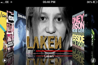 This image shows my album design in iTunes. On iTunes you would not get
the full Digipak but just the front cover so it is important that this looks
good on its own as well as an overall design.
This image shows my album design in iTunes. On iTunes you would not get
the full Digipak but just the front cover so it is important that this looks
good on its own as well as an overall design.
 To
create my ancillary texts I spent a lot of time planning out how I wanted them
to look and link together with each other and the video. After taking all of
the different images I chose a selection that I thought would work well as a
film strip design. I made them into a film strip and turned all of the images
into black and white and included this on both the Digipak and the poster. I
think this links them together nicely and also links to the video as it is
showing the artist having lots of fun in the image and some of the video is
also in black and white.
To
create my ancillary texts I spent a lot of time planning out how I wanted them
to look and link together with each other and the video. After taking all of
the different images I chose a selection that I thought would work well as a
film strip design. I made them into a film strip and turned all of the images
into black and white and included this on both the Digipak and the poster. I
think this links them together nicely and also links to the video as it is
showing the artist having lots of fun in the image and some of the video is
also in black and white.
After coming up with the images I wanted to use I went onto the text. I decided to use the same font and gold glitter colour for the text so that people would recognize that font as being related to the artist. The other text underneath tells the audience that this is a debut album which is important. There is also text there that says when it comes out which people will want to know and this is a convention of the magazine posters. I also have an amazon and iTunes image in the corner, showing where the album is available from. This is important so the target audience will know where to buy the album and when.
I think this poster would be good in a teenage girls magazine such as ‘Shout’ or ‘Teen vogue’ I think this would allow the right target audience to see the advert and would interest the people that read those type of magazines.
How effective is the combination of your main product and ancillary texts?
For the video we wanted it to be very youthful and fun, I wanted to show this through the two ancillary texts as well so the theme from the video carried on throughout. I thought that having the images looking like the artist is having fun and isn’t too serious would show this theme, rather than having a shot taken from the video although I think this would have been just as effective. All of the images I took were against a white wall; I thought that I would keep it simple and have the artist standing out over everything else so the main focus is on them. In the music video when there was multiple people in the shot the camera was always positioned so that the focus was on the artist. I want the artist to stand out when you see the Digipak and the poster so that you recognise her when you see it again and know who she is.
Although I think the three products flow quite well I think I could change the poster to improve the flow between all three of the products. The poster has a lot of text at the bottom and I like this, it breaks the conventions by having names of the songs from the album at the bottom, but I think it would look a lot better if I included some star ratings from magazines and well-known companies. I think this would have looked a lot better and brought more focus onto the artist rather than on the text at the bottom. I could of also included a comment from one of the magazines that I would include my poster in, like shout, I could have had a review from that magazine on the poster so that the readers would trust it more because their favourite magazine gave it a good review and it is also appearing in the magazine as well.
The colour scheme flows really well between all three of the products. In the music videos the images at the beginning and the last shot of the video are in black and white so the black and white images on the Digipak and poster go with this. Also the red and gold with the black is the very dominant colour scheme that flows throughout the two ancillary texts.
What have you learned from your audience feedback?
For my audience feedback I made some questionnaires and handed them out to people who suited my target audience. From this feedback I have learnt the main parts that people liked about the video and what they think I could improve. I also learnt that the video suites my target audience well as most of them were happy with the video and you can tell that it is a pop music video.
One of the main things people said to improve was having more night time shots so the video would have more of a party feel. ‘There was nothing inpaticular that I didn’t like although I think you could include more night time shots as there are quite a few daytime ones, the night time may give it more of a party feel as people normally would go to a party on the night’, ‘Partying in the daytime’. I agree with this, I think that there should have been more shots where it is the night time, however this made it more difficult to film as it was harder to get the right lighting on a night time. When we filmed the sparklers we had limited light and this caused the quality to be really bad and also you couldn’t really see much on the camera, nothing was clear when you watched the video back so we decided not to use those videos.
Another thing that was said about improvements for the video was ‘I think that the shadows in the balloons shot could be improved by having a plain white background’. When we shot the balloons scenes we needed a small room so that the balloons could take up more of it and it would look full and not really empty with just a few balloons in the room. I think we should have spent more time finding a more suitable location with nothing on the walls or in the room that could cause a shadow to appear as you can notice the shadow straight away and it takes away from the room being just full of balloons.
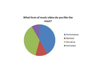
‘Which parts of the video stand out to you the most?’ This question had all different answers given; I think that there were a few different parts of the video that stood out the most. People mentioned the whole narrative of the video, the idea of going from the end of the night and rewinding back to the beginning. Other parts of the video that were mentioned was the split screen effect which is one of the shots of the video that I think stands out, they show the friends having a lot of fun and because the background in each video is the same it could almost been seen as them all together rather than in separate shots.
‘Did you understand the idea behind the music video?’ Everyone that I asked understood the idea behind the video. This is good because it shows that you can get a good understanding of what we wanted to get across and the editing that we used with the black and white was an effective way to show people that the night was going back in time to the beginning.
Do you think all of the shots in the video look good? Would you say any of them don’t go with it or don’t make sense?’ Most people said that they felt that the video flowed well throughout and they wouldn’t say any off the shots didn’t work. However one person mentioned that there weren’t enough night time shots which were also mentioned previously. I think if we worked out a way to have enough lighting in order to see the artist lip syncing and everything that is going on in the video than we would have been able to have shots when it was darker outside.
 Before
I created the music video I researched the audience and also put up a poll on
my blog and asked people to fill it out so I could find out different
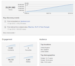
information. I looked at the demographics of the song on you tube and found out
that the main audience for the video is females between the ages of 13 up to 24
and also males between the ages of 18 to 24. This showed me that this song is
popular with both genders between the ages of 13 to 24. This helped me to come
up with the idea of the music been about a night out with friends as it relates
to this audience.
Before
I created the music video I researched the audience and also put up a poll on
my blog and asked people to fill it out so I could find out different
information. I looked at the demographics of the song on you tube and found out
that the main audience for the video is females between the ages of 13 up to 24
and also males between the ages of 18 to 24. This showed me that this song is
popular with both genders between the ages of 13 to 24. This helped me to come
up with the idea of the music been about a night out with friends as it relates
to this audience.
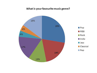
The survey on the side of my blog showed me that the majority of people that filled it out where female and between the age of 16 and 19, this is the main target audience I was aiming for. The most popular genres of music that came up on this were pop and R&B which is what how we do is. After finding out about the audience through the demographics and the survey we decided that looking at a night out would relate to the audience. This is how we came up with the idea of using the TV show skins to base the style and also skins is about teenagers that go out and have a good time and go to parties.

How
did you use new media technologies in the construction and research, planning
and evaluation stages?
I used many different media technologies to create everything and also my blog. I used blogger to post everything onto when I had completed tasks. I found blogger useful as I can link videos, add images and edit text on it. I can post code onto the html and add different things onto my posts. It also helped me to keep organised as well.

To film the music video we used my Canon 1100D SLR camera, I found the quality on this good and also the battery lasted a long time which allowed us to get a lot filmed at a time without having to recharge the battery in between filming. We used a college camera at first but found that using my own camera is easier for us because we could use it when we needed it rather than booking the camera out for a certain time. If we needed to re-shoot some shots we could do it easily without having to book the camera again after already booking it once.
To upload all of the videos and edit them I used the program called Adobe premier pro cs6 which is on the edits suites in college. At first I found the program difficult to use because I had never used it before and I found it hard to get used to how to cut down videos and add effects. However after we worked on the group task of reconstructing a existing music video and getting some experience on the program and working in a group to help each other get used to it. Once I had used the program a few times I found it easy to use but for some things like the effects e.g. the split screen we didn't know what to do at first so we asked for help but then after that we could add the effects onto the videos our self.
You tube is what I used to add my videos onto so that people can view them. Like Photoshop I have used You tube many times before so I know how to use everything on it. When I first uploaded the final music video the video quality was not very good and it was very squashed which is not how it appears on the original video. To solve this problem we went back onto the editing suite and exported the video again but changed the size of the video. When we uploaded the video to you tube again we still had the same problem but later found out that it was a problem with you tube at the time. So we uploaded the video a couple of days later and the size of the screen was right this time.
This print screen below shows my you tube page with all of my uploads on it. You tube is also an easy way to upload videos and also is easy to put onto my blog as well. I can copy and paste the HTML code for the video into the html for the post that I would like to put it on.

Word count - 3,629
In what way does your media product use, develop, or challenge forms and conventions of real media products?
For my music video I chose the song How we do (Party) by pop/R&B artist Rita Ora. Rita Ora is a fairly new artist in the music industry, bringing out her debut album last year and has had number 1 singles. The song I chose already has a music video that the artist brought out April last year. When I researched different music videos I found a few that influenced me in various different ways. We took different elements from different videos and based the idea behind our music video on the style of the popular tv series, Skins. Skins is a television series on e4 about a group of teenagers and their life.
Some of the videos I looked at that as influences are Bruno mars - Locked out of heaven. I liked the pace of editing and because How we do is a very upbeat song it goes with the idea of showing friends having fun and youth through quick cuts between different shots. We edited to the beat, which is a very common convention of all music videos as well as pop. An example of us cutting to a specific beat in the song is when the artist is changing between different outfits and in each beat the clip changes to a different outfit. When we first edited the video some of the shots did not cut to the beat and I didn't think that it worked as well as when we changed it to rythmic editing. Pop songs are usually quite fun and upbeat so the videos reflect this by having fast paced editing. It helps to get the message that the people in the video are having fun across. Another video that I looked at is Usher - Numb. I loved the effects of the lights over Usher in the video and wanted some similar effects to be in mine. Having overlapping videos is not a typical convention of a pop music video. They are usually made up of very simple shots and sometimes include split screen.
The music video includes some narrative; the idea behind the video is that is it about a night out between a group of friends. Showing friendship, youth and fun in the video. The video is mainly performance based, Pop music videos are usually either or both performance and narrative based videos. Also when lip syncing is shown in a performance shot it is usually a close up or medium close up of the artist so you can see clearly see the artist lip syncing the words to the song. At the chorus of the song the music speeds up and we edited the clips to cut between each other faster and have a lot of different changes of mise-en-scene and location. This is very common for a pop video, the song going between verse and chorus, the verse is usually a lot slower than the chorus so the pace of editing changes between the two.

The different use of camera shots in pop music videos range from long shots to extreme close ups. Close ups are used often because it shows the emotion of the video and also shows the lip syncing. Close ups also create emphasis on the location, our music video has a lot of close ups in but we also included some long shots which aren't used as often. The very first shot of the artist walking is a long shot; it shows all of that location and establishes where they are. The artist is not lip syncing in this shot so that is why we chose to have it set up as a long shot. Also in a typical music video the camera will follow the artist in the camera shots, as they are the main focus, we did this in our music video. When there is more than one person in the shot the camera was always focused on the artist out of the three people.
Digipak
 On
my digipak I wanted to have a very strong colour scheme that stood out and
really gave the artist their own style that people would recognize I used the
same style of text on the digipak and the poster so that this text is what
people recognize the artists name as. On most Digipak on the front cover you
will be able to see an image of the artist and also their name. I have kept to
this convention on my design as it is the first thing people will see of the
artist so it is important that their name and picture is on there so people
know who they are. The name of the album is the name of the artist which is
‘Laken’ a lot of new artist will call their debut album by their name and I
chose to do this so I could have the name of the artist and also the name of
the album on the front cover.
On
my digipak I wanted to have a very strong colour scheme that stood out and
really gave the artist their own style that people would recognize I used the
same style of text on the digipak and the poster so that this text is what
people recognize the artists name as. On most Digipak on the front cover you
will be able to see an image of the artist and also their name. I have kept to
this convention on my design as it is the first thing people will see of the
artist so it is important that their name and picture is on there so people
know who they are. The name of the album is the name of the artist which is
‘Laken’ a lot of new artist will call their debut album by their name and I
chose to do this so I could have the name of the artist and also the name of
the album on the front cover.| Front
cover |
Main
image/design, usually of the artist or band or something that symbolises them
or the album Name of artist/album, in a large font so it catches people’s attention. |
| Fold
out panel |
Usually
another image of the artist/band but sometimes they also have a design that
folds out right across the Digipak so you can see the whole design when it is
fully opened out. |
| Inside
panels |
Usually
another image of the artist/band but sometimes they also have a design that
folds out right across the Digipak so you can see the whole design when it is
fully opened out. Sometimes a booklet will be included There may be quotes/song lyrics from the artists and maybe some information about the album |
Typically on a digipak the colours will represent the mood and emotion of the songs and style of the album. As the song is all about having fun with friends I wanted to show this on the digipak. The colours are quite dark but I think that keeping it as a simple colour scheme allows the image to show the artist as been fun. The film strip image on the inside cover goes with the video really well, showing the artist having fun and not been too serious. The artist is pulling different faces at the camera and I like the sequence effect on the images. I have stuck to the codes and conventions a lot when it came to designing my Digipak. I think that to have the main image on the front of the product is really important as you want people to notice the artist and recognize the cover.
On the back of the Digipak I have included the album track list which is what you expect. I made sure the song titles stand out and are also clear and easy to read. I decided to include red on my Digipak as it is quite a bright colour and it also goes really well with the gold and the black and white images as well.
 This image shows my album design in iTunes. On iTunes you would not get
the full Digipak but just the front cover so it is important that this looks
good on its own as well as an overall design.
This image shows my album design in iTunes. On iTunes you would not get
the full Digipak but just the front cover so it is important that this looks
good on its own as well as an overall design.
Poster

After coming up with the images I wanted to use I went onto the text. I decided to use the same font and gold glitter colour for the text so that people would recognize that font as being related to the artist. The other text underneath tells the audience that this is a debut album which is important. There is also text there that says when it comes out which people will want to know and this is a convention of the magazine posters. I also have an amazon and iTunes image in the corner, showing where the album is available from. This is important so the target audience will know where to buy the album and when.
I think this poster would be good in a teenage girls magazine such as ‘Shout’ or ‘Teen vogue’ I think this would allow the right target audience to see the advert and would interest the people that read those type of magazines.
How effective is the combination of your main product and ancillary texts?
For the video we wanted it to be very youthful and fun, I wanted to show this through the two ancillary texts as well so the theme from the video carried on throughout. I thought that having the images looking like the artist is having fun and isn’t too serious would show this theme, rather than having a shot taken from the video although I think this would have been just as effective. All of the images I took were against a white wall; I thought that I would keep it simple and have the artist standing out over everything else so the main focus is on them. In the music video when there was multiple people in the shot the camera was always positioned so that the focus was on the artist. I want the artist to stand out when you see the Digipak and the poster so that you recognise her when you see it again and know who she is.
Although I think the three products flow quite well I think I could change the poster to improve the flow between all three of the products. The poster has a lot of text at the bottom and I like this, it breaks the conventions by having names of the songs from the album at the bottom, but I think it would look a lot better if I included some star ratings from magazines and well-known companies. I think this would have looked a lot better and brought more focus onto the artist rather than on the text at the bottom. I could of also included a comment from one of the magazines that I would include my poster in, like shout, I could have had a review from that magazine on the poster so that the readers would trust it more because their favourite magazine gave it a good review and it is also appearing in the magazine as well.
The colour scheme flows really well between all three of the products. In the music videos the images at the beginning and the last shot of the video are in black and white so the black and white images on the Digipak and poster go with this. Also the red and gold with the black is the very dominant colour scheme that flows throughout the two ancillary texts.
What have you learned from your audience feedback?
For my audience feedback I made some questionnaires and handed them out to people who suited my target audience. From this feedback I have learnt the main parts that people liked about the video and what they think I could improve. I also learnt that the video suites my target audience well as most of them were happy with the video and you can tell that it is a pop music video.
One of the main things people said to improve was having more night time shots so the video would have more of a party feel. ‘There was nothing inpaticular that I didn’t like although I think you could include more night time shots as there are quite a few daytime ones, the night time may give it more of a party feel as people normally would go to a party on the night’, ‘Partying in the daytime’. I agree with this, I think that there should have been more shots where it is the night time, however this made it more difficult to film as it was harder to get the right lighting on a night time. When we filmed the sparklers we had limited light and this caused the quality to be really bad and also you couldn’t really see much on the camera, nothing was clear when you watched the video back so we decided not to use those videos.
Another thing that was said about improvements for the video was ‘I think that the shadows in the balloons shot could be improved by having a plain white background’. When we shot the balloons scenes we needed a small room so that the balloons could take up more of it and it would look full and not really empty with just a few balloons in the room. I think we should have spent more time finding a more suitable location with nothing on the walls or in the room that could cause a shadow to appear as you can notice the shadow straight away and it takes away from the room being just full of balloons.
‘Which parts of the video stand out to you the most?’ This question had all different answers given; I think that there were a few different parts of the video that stood out the most. People mentioned the whole narrative of the video, the idea of going from the end of the night and rewinding back to the beginning. Other parts of the video that were mentioned was the split screen effect which is one of the shots of the video that I think stands out, they show the friends having a lot of fun and because the background in each video is the same it could almost been seen as them all together rather than in separate shots.
‘Did you understand the idea behind the music video?’ Everyone that I asked understood the idea behind the video. This is good because it shows that you can get a good understanding of what we wanted to get across and the editing that we used with the black and white was an effective way to show people that the night was going back in time to the beginning.
Do you think all of the shots in the video look good? Would you say any of them don’t go with it or don’t make sense?’ Most people said that they felt that the video flowed well throughout and they wouldn’t say any off the shots didn’t work. However one person mentioned that there weren’t enough night time shots which were also mentioned previously. I think if we worked out a way to have enough lighting in order to see the artist lip syncing and everything that is going on in the video than we would have been able to have shots when it was darker outside.
 Before
I created the music video I researched the audience and also put up a poll on
my blog and asked people to fill it out so I could find out different
information. I looked at the demographics of the song on you tube and found out
that the main audience for the video is females between the ages of 13 up to 24
and also males between the ages of 18 to 24. This showed me that this song is
popular with both genders between the ages of 13 to 24. This helped me to come
up with the idea of the music been about a night out with friends as it relates
to this audience.
Before
I created the music video I researched the audience and also put up a poll on
my blog and asked people to fill it out so I could find out different
information. I looked at the demographics of the song on you tube and found out
that the main audience for the video is females between the ages of 13 up to 24
and also males between the ages of 18 to 24. This showed me that this song is
popular with both genders between the ages of 13 to 24. This helped me to come
up with the idea of the music been about a night out with friends as it relates
to this audience.The survey on the side of my blog showed me that the majority of people that filled it out where female and between the age of 16 and 19, this is the main target audience I was aiming for. The most popular genres of music that came up on this were pop and R&B which is what how we do is. After finding out about the audience through the demographics and the survey we decided that looking at a night out would relate to the audience. This is how we came up with the idea of using the TV show skins to base the style and also skins is about teenagers that go out and have a good time and go to parties.
I used many different media technologies to create everything and also my blog. I used blogger to post everything onto when I had completed tasks. I found blogger useful as I can link videos, add images and edit text on it. I can post code onto the html and add different things onto my posts. It also helped me to keep organised as well.

To film the music video we used my Canon 1100D SLR camera, I found the quality on this good and also the battery lasted a long time which allowed us to get a lot filmed at a time without having to recharge the battery in between filming. We used a college camera at first but found that using my own camera is easier for us because we could use it when we needed it rather than booking the camera out for a certain time. If we needed to re-shoot some shots we could do it easily without having to book the camera again after already booking it once.
To upload all of the videos and edit them I used the program called Adobe premier pro cs6 which is on the edits suites in college. At first I found the program difficult to use because I had never used it before and I found it hard to get used to how to cut down videos and add effects. However after we worked on the group task of reconstructing a existing music video and getting some experience on the program and working in a group to help each other get used to it. Once I had used the program a few times I found it easy to use but for some things like the effects e.g. the split screen we didn't know what to do at first so we asked for help but then after that we could add the effects onto the videos our self.
Photoshop is what I used to edit my images and create the ancillary texts. I have had a lot of experience in using Photoshop of the past couple of years in media and in my other lessons I use it a lot so I found it easy to create my digipak and poster how I wanted them. I also have access to Photoshop at home so I could work on my products at home as well as at college. I already know how to use all of the tools on Photoshop so I found it very useful to create my products as I could just get on with them without having to ask for help because I know Photoshop well.
You tube is what I used to add my videos onto so that people can view them. Like Photoshop I have used You tube many times before so I know how to use everything on it. When I first uploaded the final music video the video quality was not very good and it was very squashed which is not how it appears on the original video. To solve this problem we went back onto the editing suite and exported the video again but changed the size of the video. When we uploaded the video to you tube again we still had the same problem but later found out that it was a problem with you tube at the time. So we uploaded the video a couple of days later and the size of the screen was right this time.
This print screen below shows my you tube page with all of my uploads on it. You tube is also an easy way to upload videos and also is easy to put onto my blog as well. I can copy and paste the HTML code for the video into the html for the post that I would like to put it on.

Word count - 3,629