Friday 11 January 2013

Digipak Track listing design

These two designs are the same but slightly different. I have added a texture onto the second design and I like this effect better than the first design. I think that having the darker red colour for the text makes it stand out more and improves the overall presenation of the design.

Digipak design

Here is a design that I have come up with for my Digipak. I need to do a photo shoot with the artist and put it all together in Photoshop. I also need to adapt my design for a different Digipak design as I need to have spaces for two discs so I need to change one of the images to a space for another disc. I think I am going to leave out the image with the clothes etc. as I would rather have images of the artist. I Could leave the image with the clothes in the same place but I don't think it will look very good with a CD over the top so I could use it as the design for the Cd and move it too the inside. I am also going to change the inside image on the left and use a different image. I have planned to do a photoshoot with Laken and we are going to take a lot of different images so that we have a lot to choose from.


Codes and conventions

  • Name of artist and album should be somewhere visable on the front of the Digipak. Usually it is just the album name on the front cover.
  • There is usually an image of the artist on the front of the digipak as well, a visual image 
  • On the spine of the Digipak there will usually be either both or one of the following, album name and artist name - A debut album from an artist is commonly called the artists name so if the album is called what the artist is then they can just include one piece of text on the spine of the digipak. It also allows the audience to recognise the artist by their name, artist often use the same font for their name, it almost becomming a logo which  people recognise
  • On the back cover there should be a barcode
  • The album tracklist/what's on the dvd is also usually shown on the back of the album
  • Sometimes albums may have quotes from reviews from well known companies. e.g. NME etc.
  • The colour scheme should represent the mood of the album and all of the songs.

Front cover:
  • Main image/design, usually of the artist or band or something that symbolises them or the album
  • Name of artist/album, in a large font so it catches peoples attention.
Fold out panel:
  • Usually another image of the artist/band but sometimes they also have a design that folds out right accross the Digipak so you can see the whole design when it is fully opened out.
Inside panels:
  • Usually another image of the artist/band but sometimes they also have a design that folds out right accross the Digipak so you can see the whole design when it is fully opened out.
  • Sometimes a booklet will be included
  • There may be quotes/song lyrics from the artists and maybe some information about the album

Digipak Planning


  • Colours - Black, Gold, Red? - To show Glamour, rich colours, night out
  • Black and white images with the red and gold on top
  • The idea of using light, like in the music video where it is projected onto the artist, either use a clip of that or take more images using shutter speed
  • Having a section with an image of props like a dress, necklace, straighteners etc as if someone has been getting ready for a night out
  • Images of the artist, looking glamorous, looking as if they are going for a night out, same costume as in the video?
  • CD design - Just plain black with the gold and red writing on so the background can be quite busy with an image on and then that stands out over the top of it
  • The front image is going to be of the artist, I want the artist to look like they are having fun and happy so it portrays this image of her when people first see the Digipak

Digipak

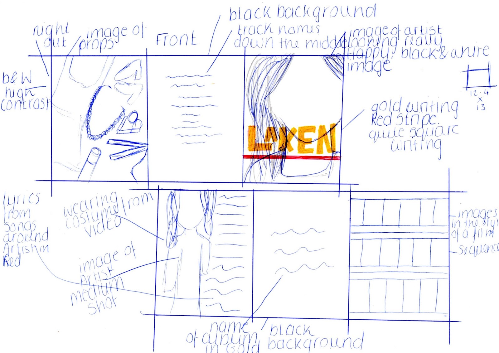
I must create a digipak and advert to go with my music video. I want the Digipak to go with the theme of the music video, so maybe using a clip of the light (the city lights) used in the video somewhere in the design would work well. I am going to have images of the Artist which means I need to do a photo shoot of them. I want a few images of the artist on the digipak and also a section which says the name of the song really big so it stands out.

Digipak are most commonly used for EP's and Deluxe albums now. The Digipak design is used instead of the usual album packaging and used by most record labels. The Digipak has a much more stylish look and allows the artist to include more content on their case and also use a lot more imagery.

Below are some examples of existing digipaks:
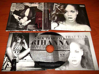
Rihanna - Talk that talk digipak (2011)
I love the design of this digipak, I think that the imagery used on it is really interesting and i like the use of the newspaper design on the CD. The black and white looks really good, especially with the red writing on top. From looking at the Digipak you can see what genre it is, the facial expressions and costume that Rihanna is wearing is stereotypical of Pop/R&B. With my Digipak I want the person viewing it to be able to tell what Genre the song is and the style of the artist.

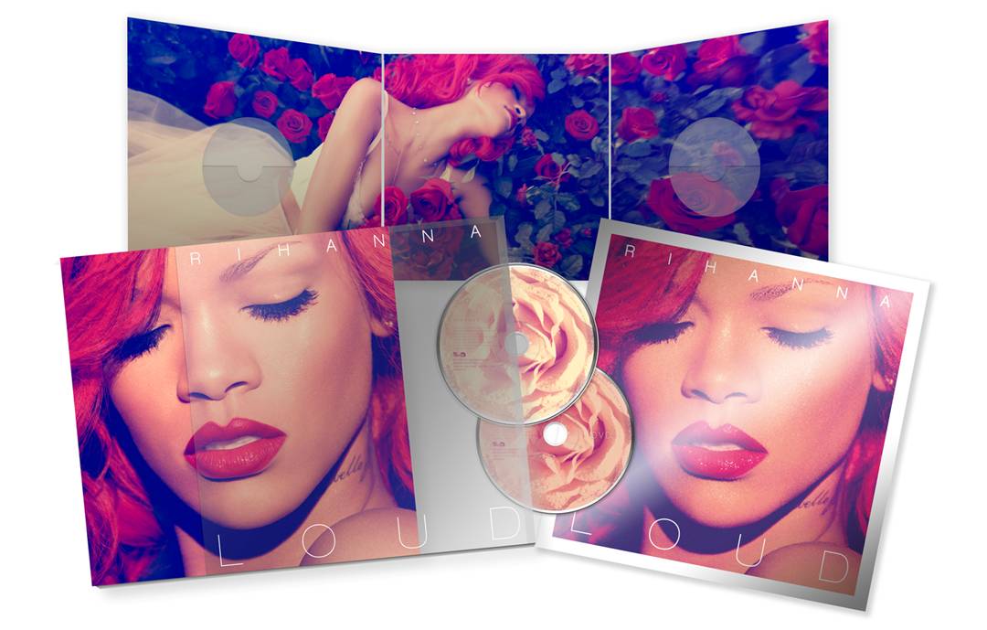
Rihanna - Loud Digipak (2010)
Again you can tell what Genre the album is just by the facial expressions and costume that Rihanna is wearing. Having Rihanna on the cover will immediately attracts all of her fans, they will see it is Rihanna so will want to buy it. It is important to have the artist on the front of the digipak as that is the first thing people will see about it and you want them to notice your artist. Her bright red hair really stands out on the cover and that colour is used all the way throughout the digipak so a colour scheme is also very important. Having Rihanna with red hair and then a lot of other colours on other parts of the Digipak wouldn't look very good so keeping the colours simple is a lot more effective. The red colour could also represent a completely new look and new sound for Rihanna, with the red hair she completely transformed her look so the red throughout the rest of the Digipak could mean a new sound for a new album. The colour red also reflects the idea of Love and Lust which is what a lot of the songs are about on This album. And compared to her previous albums like Rated R this is a completely different style.

I really like the contrast with the red roses against Rihannas skin and dress, they look really good. Costume and colours are really important for this Digipak. They need to show a message and in order to get that across in the way i want I really need to think about what I want the Digipak to say about the artist and what colours/costume will reflect this. 

The text on the Digipak and very plain and simple, I think that they wanted the main focus to be on the artist and not on the content of the CD. Rihanna is already very well known by many so her name didn't need to be bold and the most important thing that stands out on the cover. People already know who the artist is just by looking at an image so I think that is why they have used the white text.

Katy Perry - Teenage dream Digipak (2010)
The big theme on this Digipak is candy, you can see this on the CD designs of the donut and the swirls like a candy cane. The images of Katy Perry are of her on a cotton candy cloud and on the top she is wearing a candy crown as well as being surrounded by sweets. This could be a representation of Katy Perry having a sweet personality and could also portray her to be innocent, however she has no clothes on some images on the front cover so this does contradict this message of innocence. The genre of music for this is pop, the theme kind of shows that her music is fun. 
The digipak is targeted more towards females with Pink being the main colour, I think it appeals to a wide female audience but maybe a younger audience would be more interested in her music. The Digipak relates to her music video 'California girls' with the candy theme all the way through that. 


Improvements to make

  • Do some more filming outside shots -We like the ones that we have done already so want to use more in the video
  • More performance shots are needed
  • We need to fill in the missing gaps in the video but we don't want to use the same videos more than once too many times
  • The editing has gone well so far. I don't think we need to change any of the shots we have put on the video so far.

Music video Draft 1


This first draft has a lot of parts missing from it. We need to do some more filming and add a lot more video into the missing sections of the song. I think the split screen shot towards the end has worked really well and I want to film some more of those to add into the next draft.