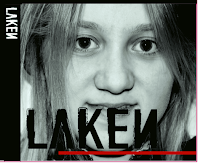
To create the font for my digipak I used the website Da font and choose the font I thought would suite the album and style I was going for the best. I ended up choosing a font called denial. I felt that this would go really well with the style I was going for which is quite Glamorous with the rich red and gold colour scheme. I like that the font looks quite distressed and rough but is also very clear and fun.
 After choosing my font I then typed the artist name into the website, which is Laken, so that it came up with the name in my chosen font. I could then screen shot the page and crop the text so that I can use it on my digipak. I screenshotted the text and then pasted it into photoshop.
This print screen below shows the text on the Digipak before I added the gold glitter over the top. To get rid of all the white background around the text I used the wand tool and clicked on the white and then clicked on select>similar. I then pressed delete to delete all of the white from the image.
This print screen also shows the text on the side of the digipak in white. To turn the text white for that part of the digipak I clicked on Image>Adjustments and then Invert.

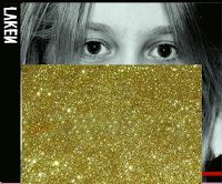
These print screens show how I added the glitter effect onto the text on the front of the digipak. I used this image that I searched for on google images and copied and pasted it into photoshop on a separate layer to everything else. I made sure that the layer was above the layer with the black text on so it would appear on top of it.
After copying and pasting the image into photoshop I then used the wand tool to select the text and then clicked on select inverse so it selected all the background behind the text.
The next step was to delete all of the extra image that I didn't need. So I deleted this and I was left with the gold glitter image in the shape of the text that I had already inserted. I then moved the gold glitter text on it's layer so it slightly revealed some of the black underneath, giving it an overlapping effect.


No comments:
Post a Comment